VanGo
Role:
Lead UX Researcher and Designer
Responsibilities:
User research, wireframing, prototyping, user testing
Duration:
February-April 2023
Project Overview
The problem:
Most NYC galleries have associated websites/apps designed as a supplement for users visiting in person, but often do not offer alternative viewing experiences for users outside the gallery.
The goal:
Allow users to attend virtual walkthroughs of the gallery via website or app in order to provide a similar gallery-viewing experience as in-person viewing.
VanGo is an app designed to provide a virtual walkthrough of a mock NYC gallery,
specifically designed to assist people who want to enjoy a typical gallery experience,
but may not have the ability to visit these galleries in person.
My user research had started by looking into any New Yorker’s journey from their home to a well-known gallery in the city, and evaluating what obstacles could occur at any step of the process. At first, I knew that I wanted to include a virtual walkthrough alternative for users that weren’t able to visit galleries in person, but upon doing further research, I found that it was equally as important to include a ticket-buying experience to incentivize in-person users to use and download the app as well.
Thinking more about a virtual approach to a gallery led me to include more information about artwork, as well as ways for users to save artwork for later to create a more personalized experience than offered in person.
Understanding the user
Pain Points
-
Visiting galleries in NY or any densely populated city can prove to be a challenge to art lovers who aren’t available to visit in person (scheduling conflicts, travel difficulty, etc.).
-
Lines for tickets at popular galleries are long and could be easily eliminated with an ticket booking option via app.
-
Users who want to remember art for later currently have to take pictures of artwork while in the gallery, and are unable to save their favorites in a central location.
Meet the users
PRIMARY
Name: Kevin
Age: 68
Occupation:
Retired art teacher
Kevin is a wheelchair bound
retired art teacher who just recently
moved to NYC. He wants to explore the galleries around him, but finds it difficult to navigate the subways in a wheelchair and would prefer something he could use at home.
SECONDARY
Name: Shawn
Age: 25
Occupation:
Aspiring surgeon
Shawn is a medical student in
NY studying to become a surgeon.
He loves art and wants to explore,
but often finds that his schedule doesn’t allow him to visit galleries during open hours, so he’s looking for something new.
Paper wireframes
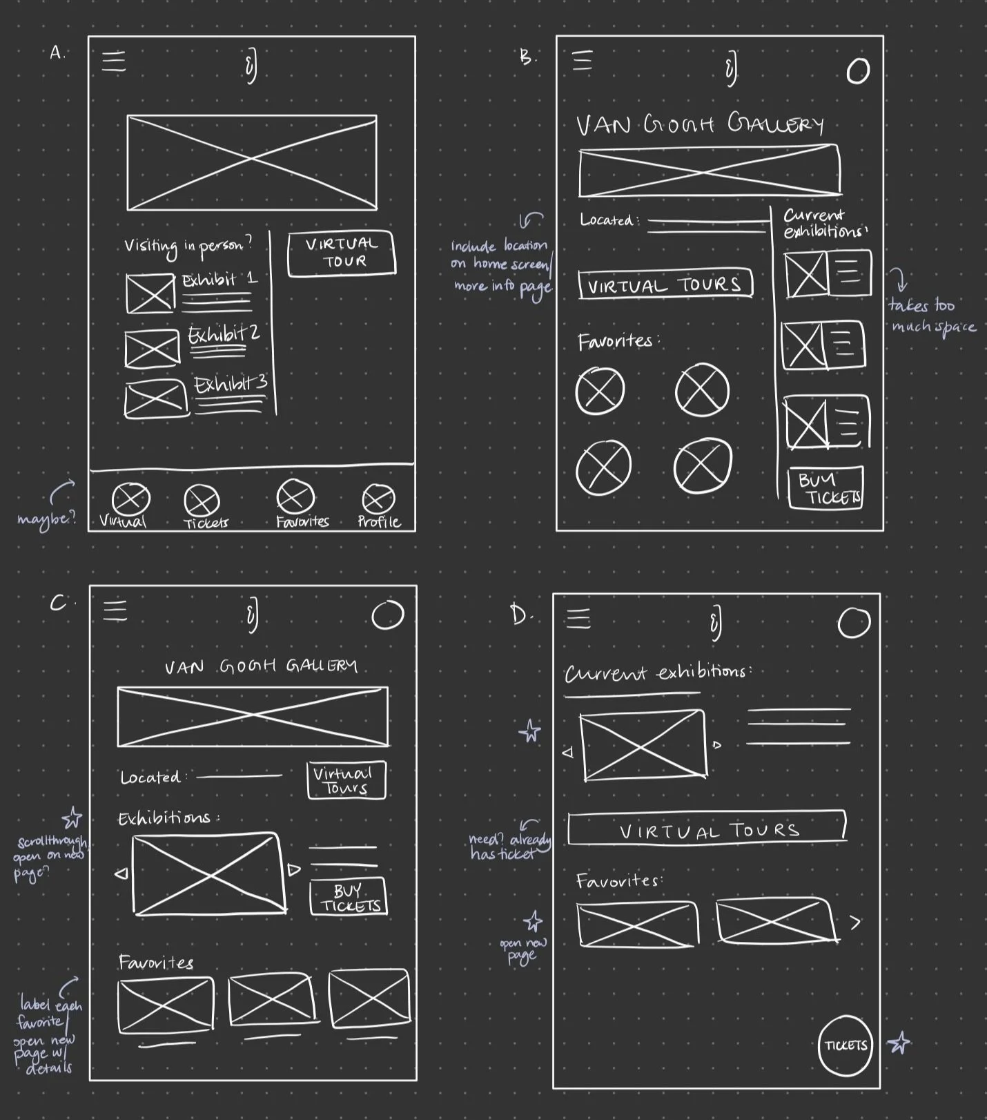
I created several wireframes for a possible home screen for VanGo, rotating through including a central map, a static ticket button, favorites, and a navigation bar at the bottom. I finally decided upon highlighting the current exhibits as well as a ticket booking button on the home page, with a navigation menu available for easy booking.
Digital Wireframes
To start designing the digital wireframes, I wanted to keep both types of users in mind: in-person users vs. virtual users. The users visiting the gallery in person would need an incentive to download the app, which was exemplified through a ticket purchasing feature on the app, allowing users to skip ticket lines and save time. Featuring this on the home screen would allow these users to quickly purchase their in-person ticket, but would also allow them to scroll through the app and glance at the virtual tour option. The home screen allows users to quickly get to the ticket purchasing screen, but also features current exhibitions featured in the gallery for the benefit of both groups of users.
Home screen:
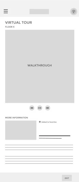
The virtual tour home screen was designed to parallel the experience of going to a real museum, prompting the virtual user to select a floor of the gallery before starting the tour. However, before selecting the floor number, users are given floor maps and a breakdown of exhibits per floor, as well as any seasonal featured exhibits they may want to view. Then, the user can move to the start of the tour, where they can select a piece of artwork and add it to their favorites.
Virtual tour screens:
Usability Studies
I then conducted an unmoderated usability study on 9 individuals between the ages of 19 and 60, prompting each user to:
Buy a ticket for a virtual tour from the home page
Attend a virtual tour
Add a piece of artwork to their favorites
View favorites at the end of the tour
Findings
〰️
Findings 〰️
Round 1 Findings:
Home and back navigation buttons should be available on every page.
Virtual tour home screen has two different dropdown menus - one for maps, and one to start the tour.
Font size was too small.
Round 2 Findings:
Create search option for artwork.
Add more information about museum in an about menu.
Star icon for favorites was too small and difficult to click.
Find the final mockup here:
Next steps
Complete another round of user testing with users who regularly attend galleries in order to gain proper insights.
Allow users to search for exhibits across galleries, providing a one-stop shop for users that want to learn more about a particular exhibit without leaving their home.
Complete a secondary competitive analysis to search for more ways to differentiate this app from an in-person experience to incentivize all users to download it.


